Case Study · Visual Design
WordPress Social
Ad Experiments
Pushing the boundaries of a visual language

Case Study · Visual Design
Pushing the boundaries of a visual language
Overview
After the roll-out of WordPress.com's 2019 campaign, the Creative Studio was given the opportunity to play with a few different expressions of the brand. We had room to explore how our visual style should evolve for different platforms and in motion. I designed our first-ever Pinterest ads and defined what "building a site" might look like as a quick motion ad.
For each of these projects, I wrangled the creative brief and facilitated cross-team collaboration to bring fresh, high-performing creative to our marketing channels.
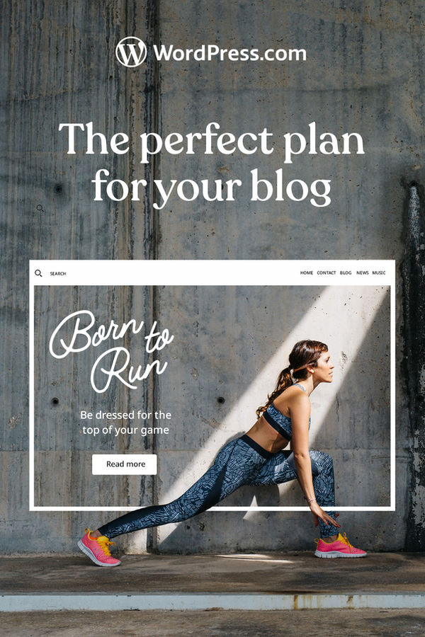
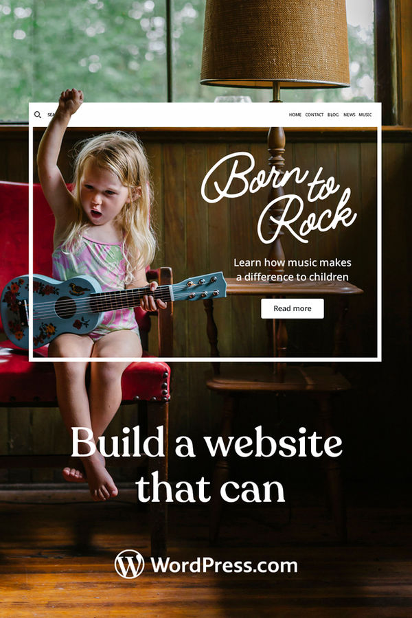
New Audience, New Channel
For our first set of Pinterest ads, we wanted to really focus on bold visuals that would appeal to female bloggers. The goal was to clearly depict site-building, while keeping the imagery fun and fitting to the Pinterest platform. This ad style performed the best of all we tested.
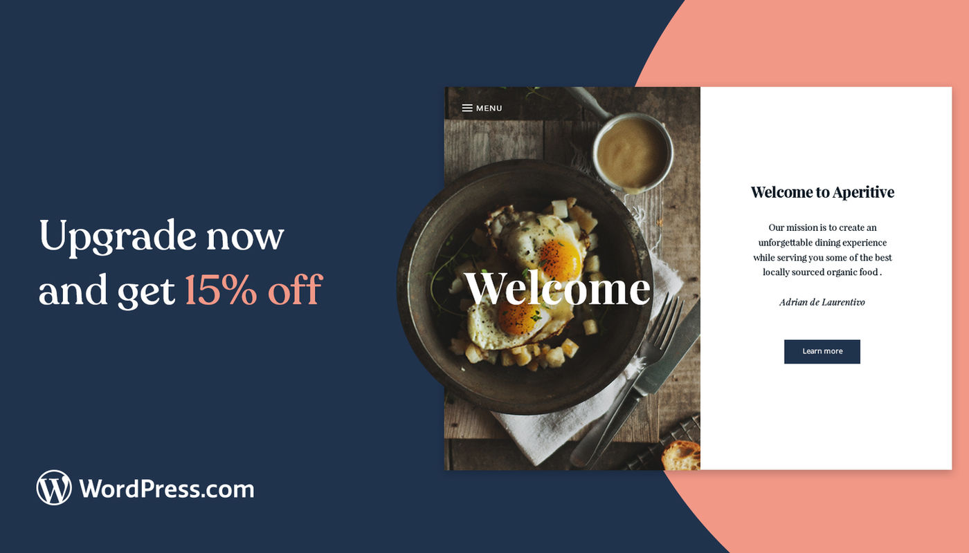
How Do We Move?
Our marketing team wanted to test out sale messaging for a prospecting audience on our social channels. I used this as an opportunity to explore what building a site looks like for our brand. It was also a chance to create more abstract representations of WordPress themes.
New Styles
We wanted to explore presenting our 24/7 support offering in a more fun and eye-catching way, that wasn't bound by the current constraints of our visual language. This short motion piece played off the idea of a neon "open" sign to quickly get users' attention while scrolling.