Case Study · Product Design
Invoices Null
State Redesign
Using research insights and product instincts to increase the invoices null state CTR by ~20%
Case Study · Product Design
Using research insights and product instincts to increase the invoices null state CTR by ~20%
Background
The Invoices funnel had a 55% drop-off rate from high-intent sellers landing on the product page to sending their first invoice. While there were a number of probable factors likely contributing to this, the team identified the current invoices null state as a clear opportunity to address the drop-off. In its current state, rather than offering guidance or context, the dashboard simply showed empty data, giving sellers no information to orient themselves or clear actions to take next.
We saw an opportunity: if we replaced the empty dashboard with contextual content about the product and its benefits, more sellers would take the next step. But the page needed to work for two very different audiences. Sellers who signed up specifically for Invoices needed a clearer path to action, while sellers casually exploring Square needed context on why Invoices would help their business. Additionally, we had limited objective data on what kind of content would most likely incentivize them to take action.
Competitive Audit
To better understand the null state landscape in terms of both messaging and structure, we audited pages across four competitors (Zoho, Mailchimp, Freshbooks, and Honeybook) as well as several internal Square product pages. Three structural patterns emerged, each with a distinct tradeoff between user control and information density.
Product null state design patterns
An informational guide overlays the product page to walk users through key features, without changing the underlying layout.
Honeybook
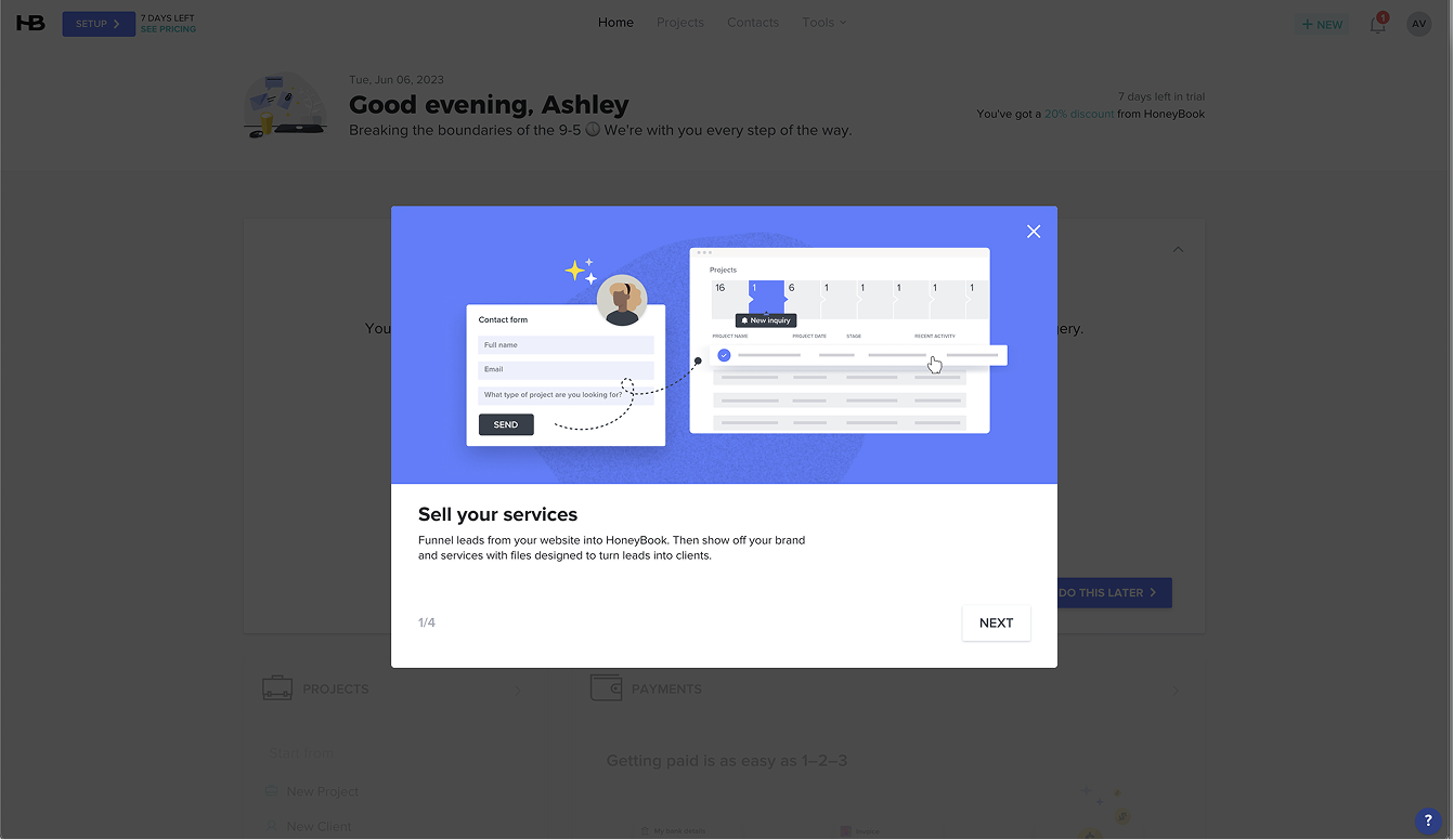
Honeybook
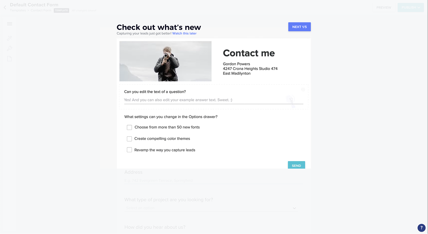
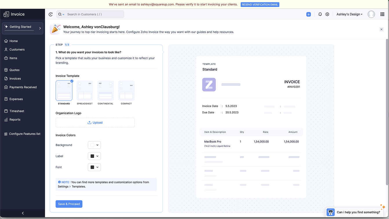
A dedicated setup page surfaces in the nav and guides users through key actions. Once setup is complete, the page disappears.
Mailchimp
Zoho
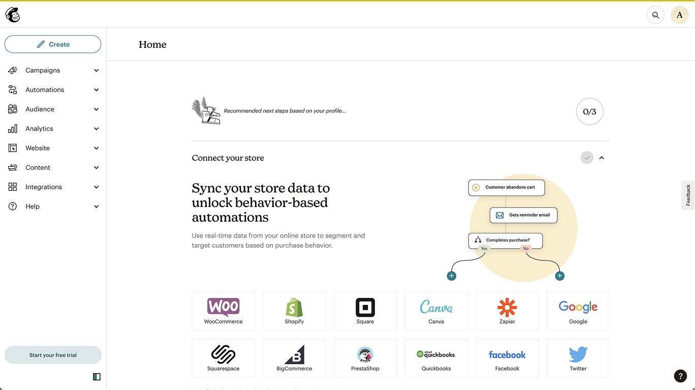
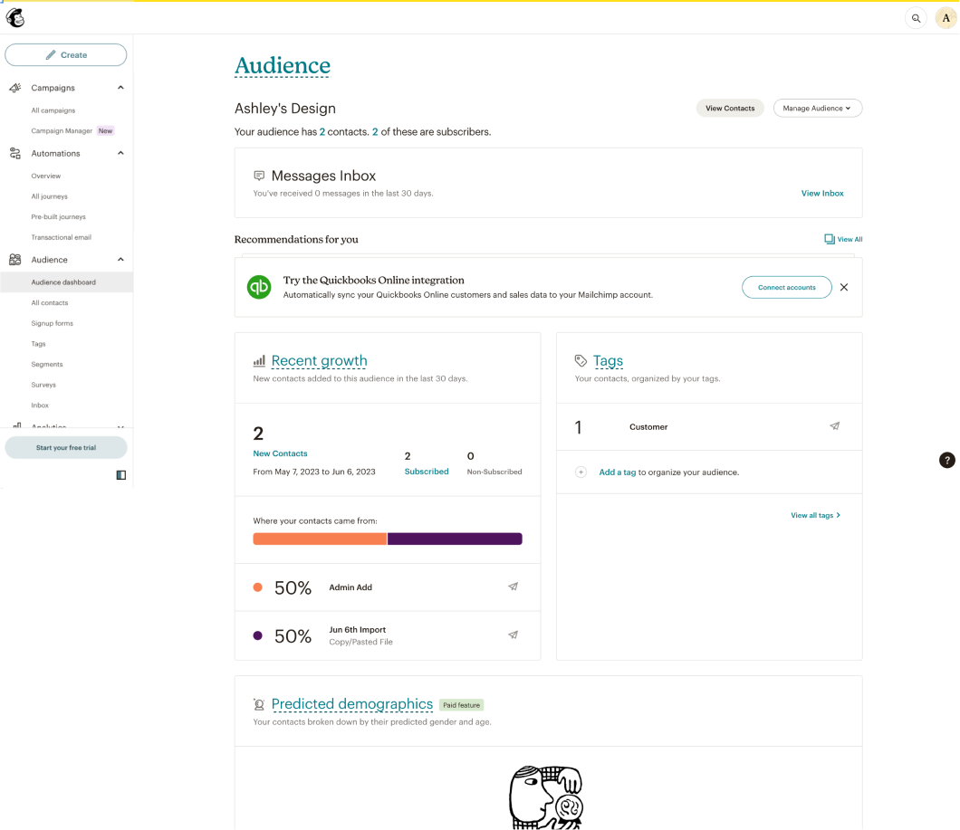
The product page itself adapts, surfacing CTAs, educational content, and feature context that evolves as the user engages. Once used, the page shifts toward the standard product view.
Mailchimp
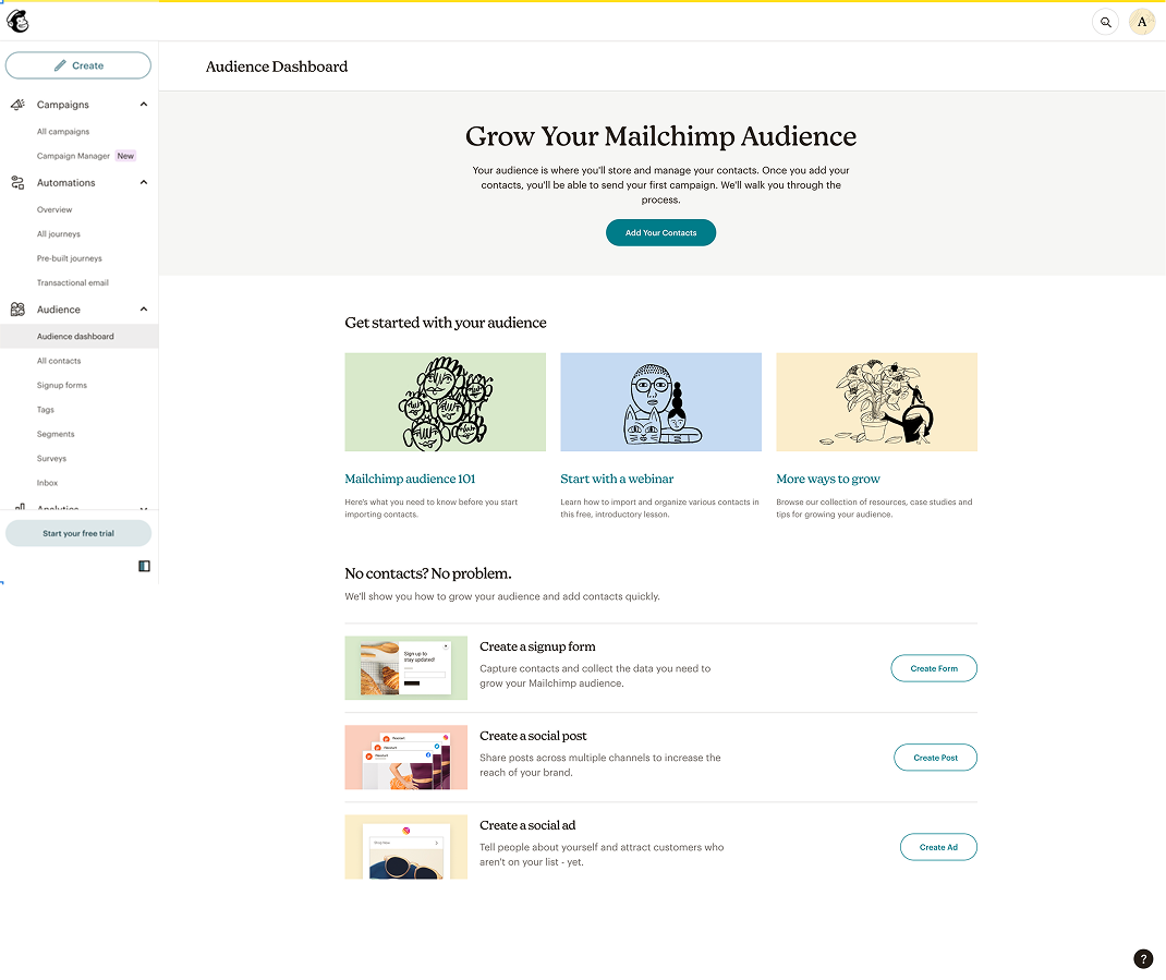
Mailchimp
Ultimately, we felt that despite its higher design overhead, the dynamic null state would let us create a more broadly relevant page, one that could adapt based on what we know about sellers and the actions they take in the product.
Before jumping into design, we mapped how Zoho, Mailchimp, and Square Marketing each structured their content sections. This helped us identify which modules (primary CTAs, product features, educational content) were common across implementations and gave us a shared vocabulary heading into the brainstorm.
With the evolving page direction decided, we ran a cross-functional session with engineering, product, marketing, and design to align on content strategy. Three questions framed the conversation: how do we help get sellers started, what key information should sellers know about the product in their first few days, and what benefits does the product offer?
Approach
Coming out of the brainstorm, we aligned on two potential paths forward: one focused on explaining the benefits to new users, and the other focused on helping high-intent sellers get started quickly. Each implied different content priorities. The marketing-led approach would lead with high-level product value, while the set-up-led approach would prioritize showing first actions to get started.
Both variants used a simple, modular design system built from interchangeable content blocks. This meant future testing, audience-specific customization, and optimization could happen through content swaps rather than structural redesigns, giving us a scalable foundation without additional engineering investment.
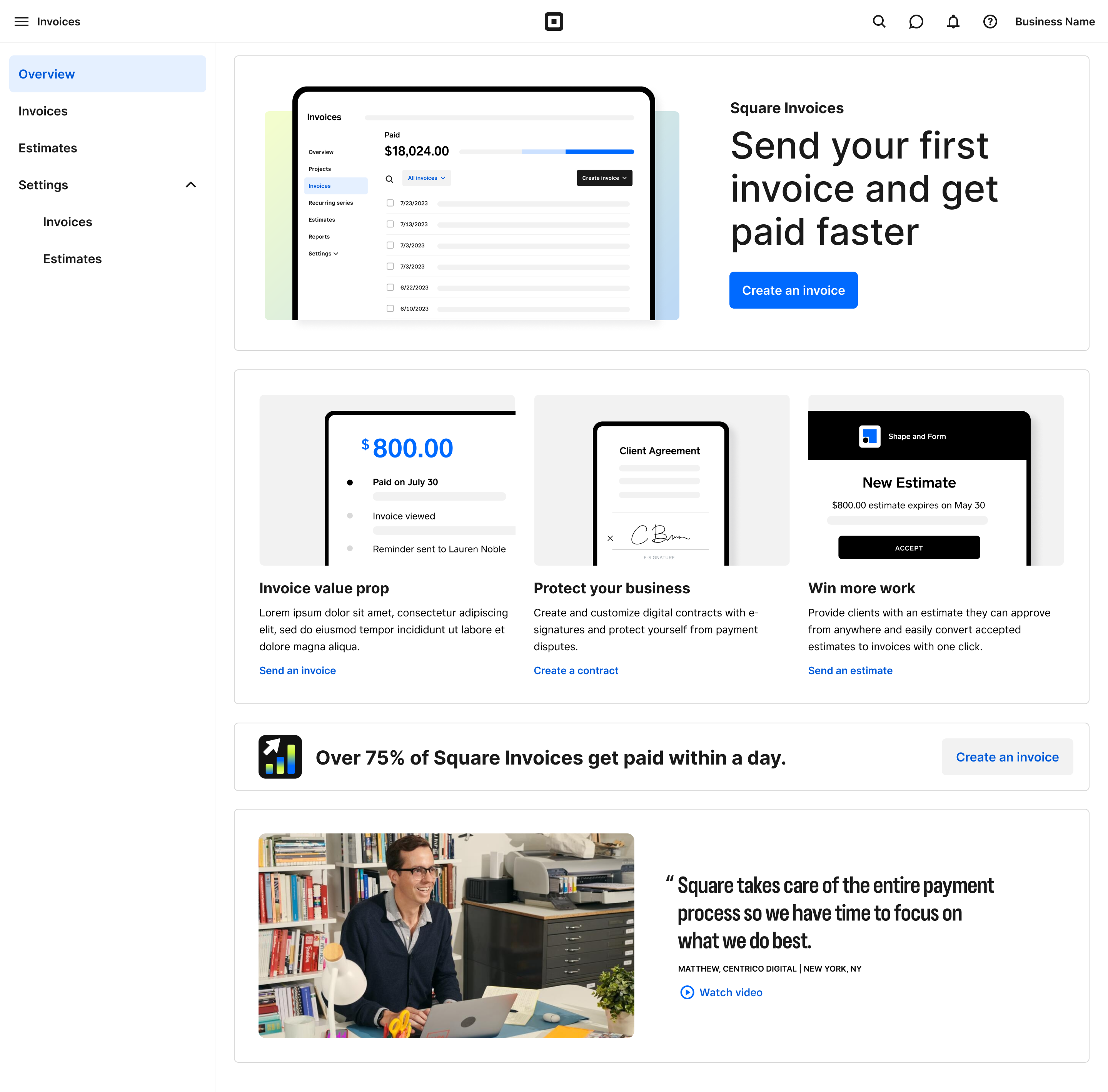
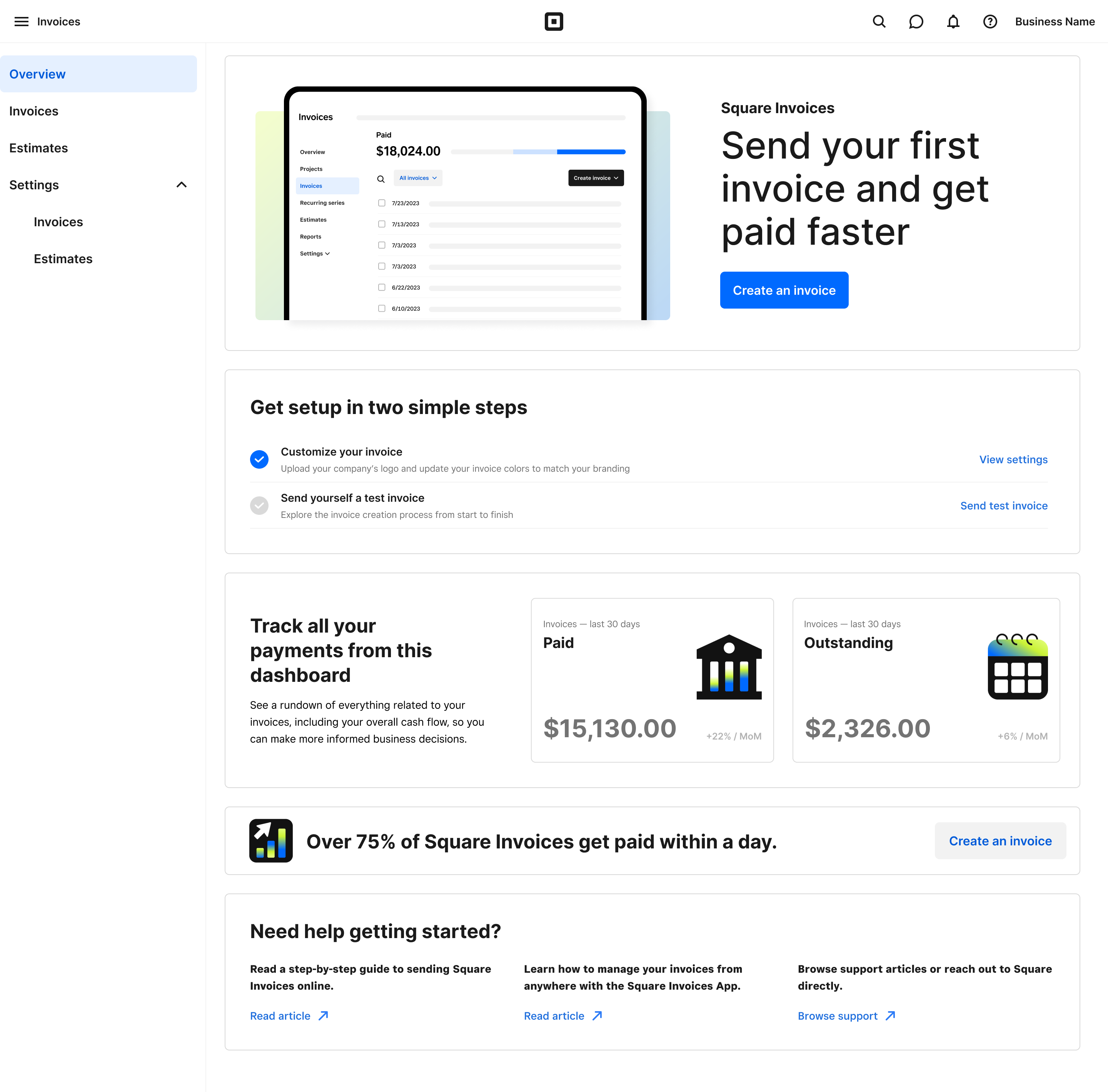
Solution
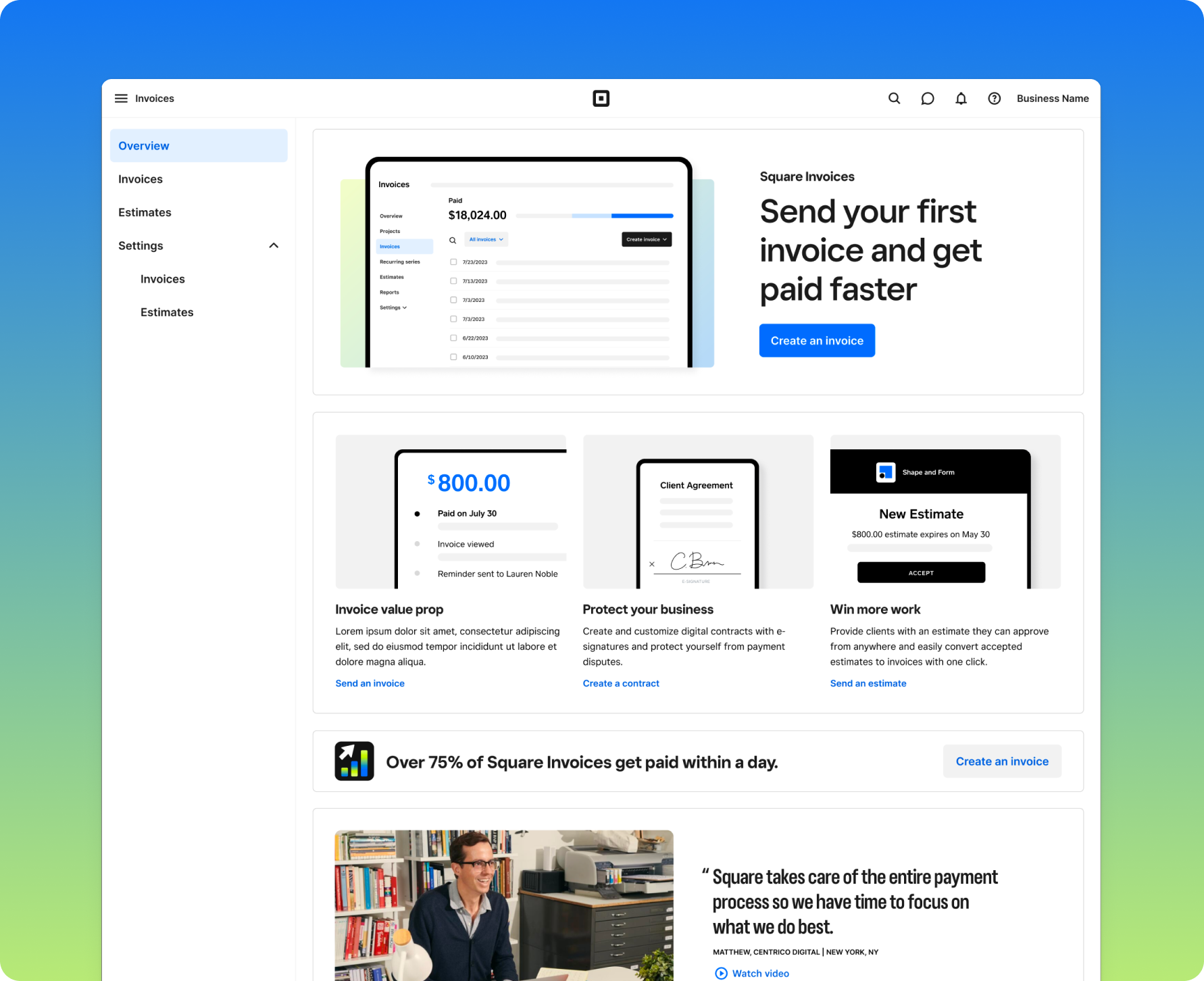
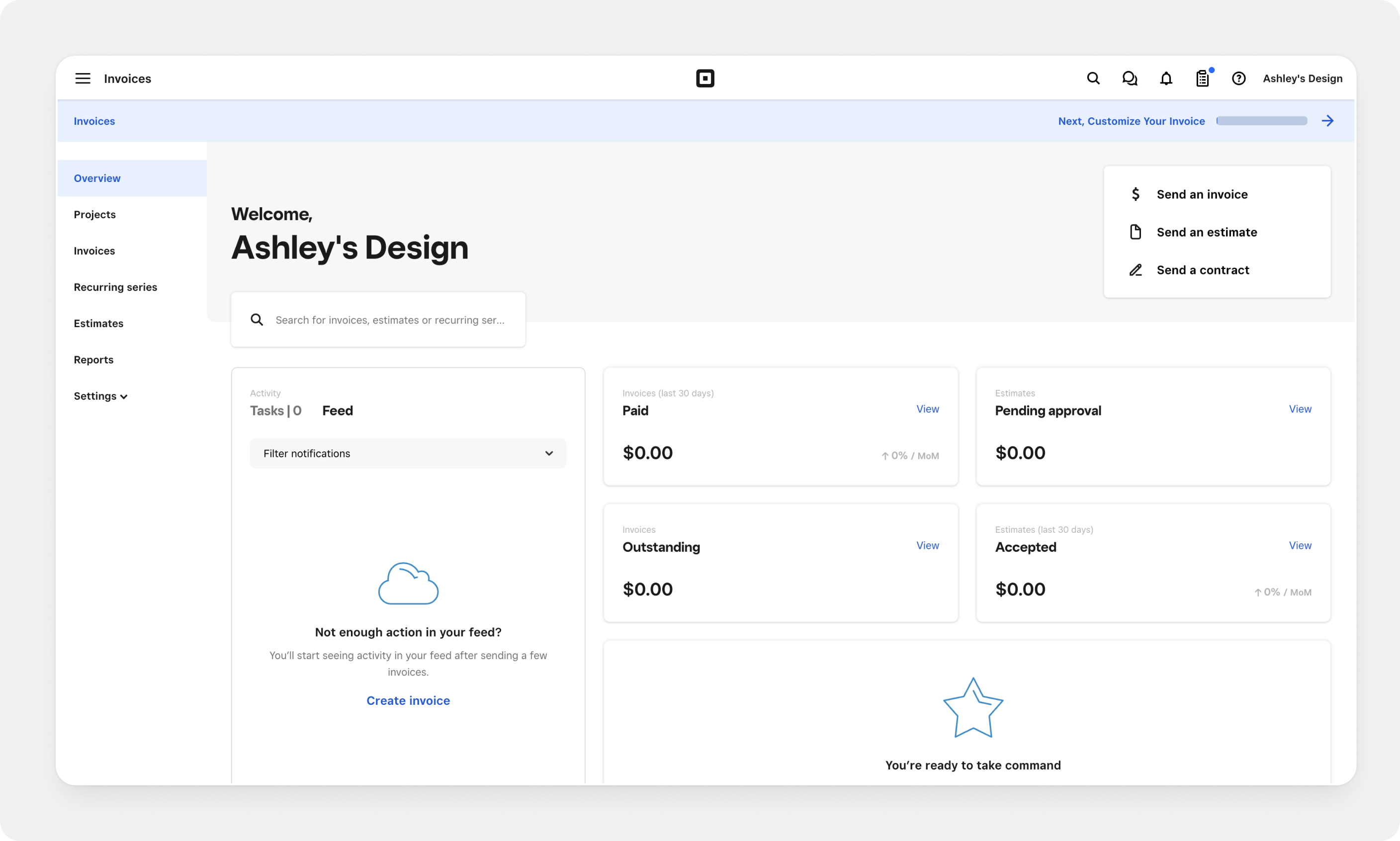
The dynamic null state adapts as sellers engage. Each variant opens with a different content strategy, but both follow the same progression, shifting from an introductory layout to an action-oriented view after the first send, then settling into the standard product experience.
Marketing-led
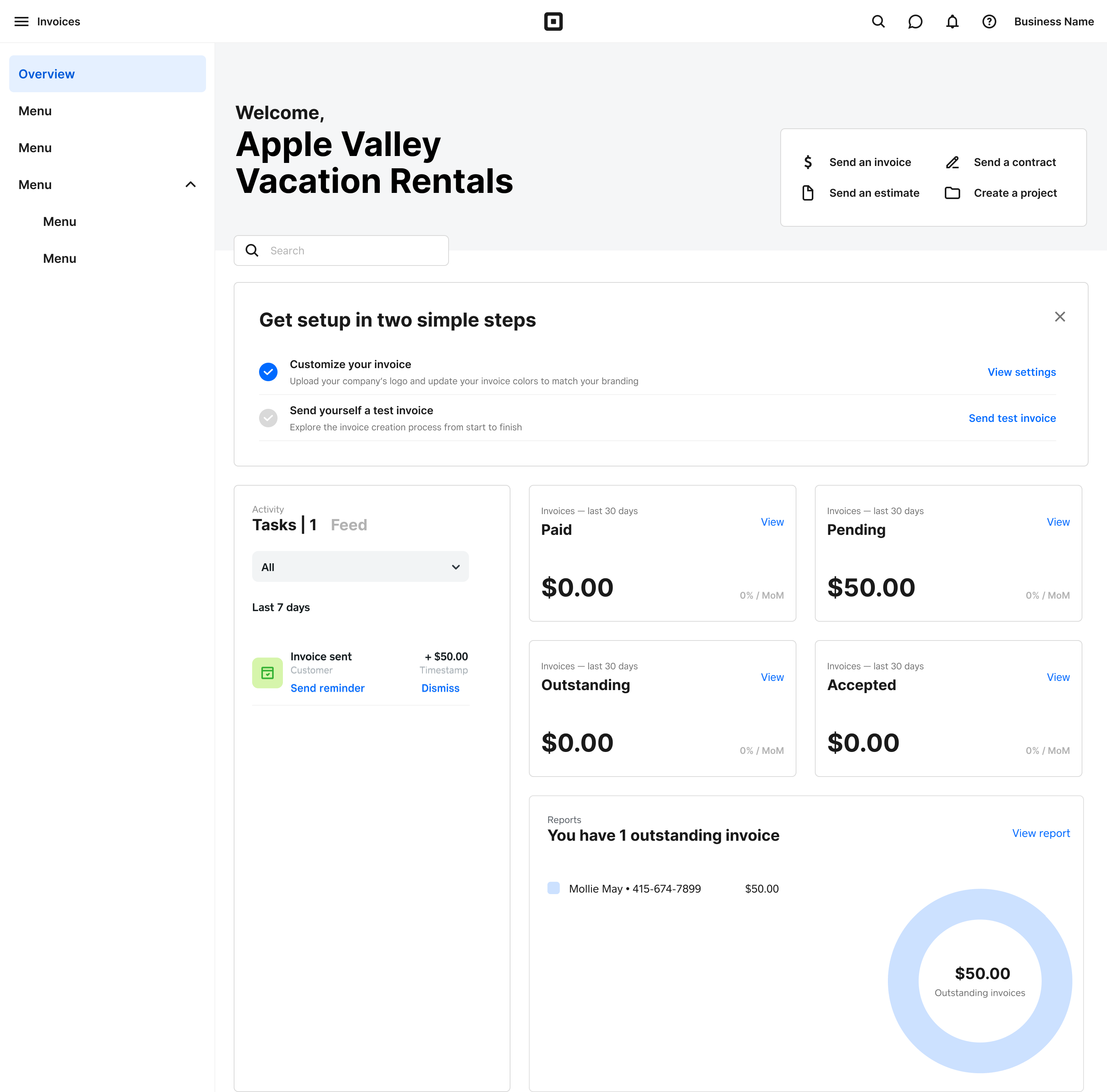
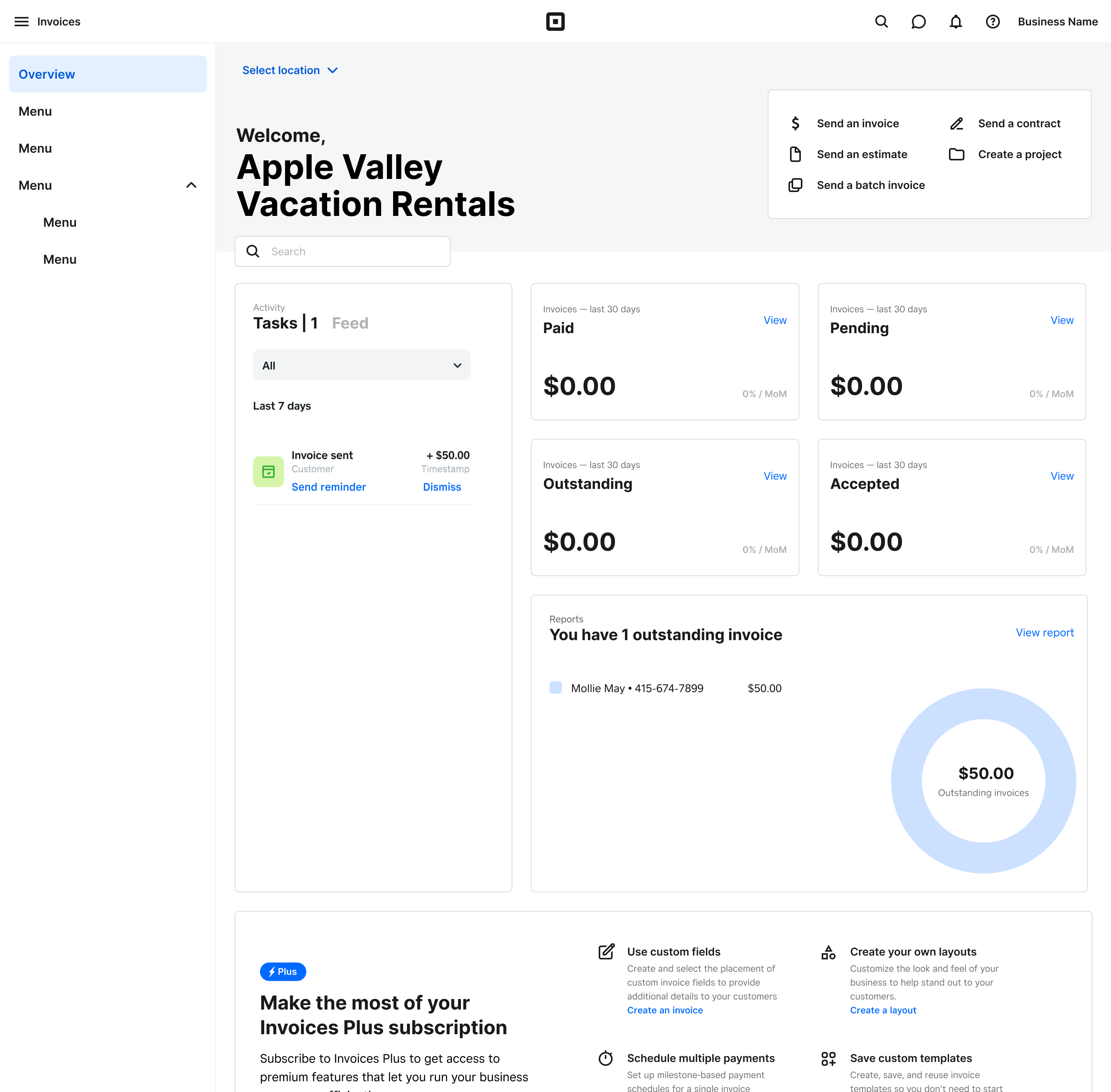
Set-up-led
Both variants exceeded our 5% target, with the marketing-led page delivering roughly 4x the expected lift. The results confirmed that grounding design decisions in competitive research and cross-functional alignment leads to high-confidence hypotheses. The A/B test measured magnitude, not direction.
Beyond the immediate metrics, the modular content block system we built means the team can now run future tests, targeting different audiences, adjusting messaging, or swapping content, through simple configuration changes rather than structural redesigns.