Case Study · Visual Design
Creating a new brand language for Automattic's design division
The Original Task
The Automattic design blog was filled with great content by incredible designers, but unfortunately, from a visual and experiential perspective, didn't reflect the kind of progressive design we espoused in our posts. We needed to rebuild the site from the ground up, so that it reflected the best of our product and design sensibilities.
The Approach
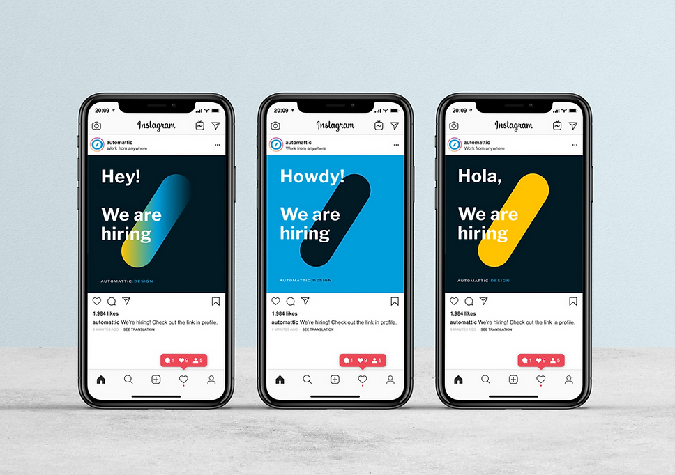
Once we started exploring how to create a new theme, we realized we also needed to make adjustments to the visual brand. We didn't want to totally rebrand Automattic. Rather, we wanted to give Automattic Design a unique flavor of its own that could be used for the site, hiring, and design-focused events.
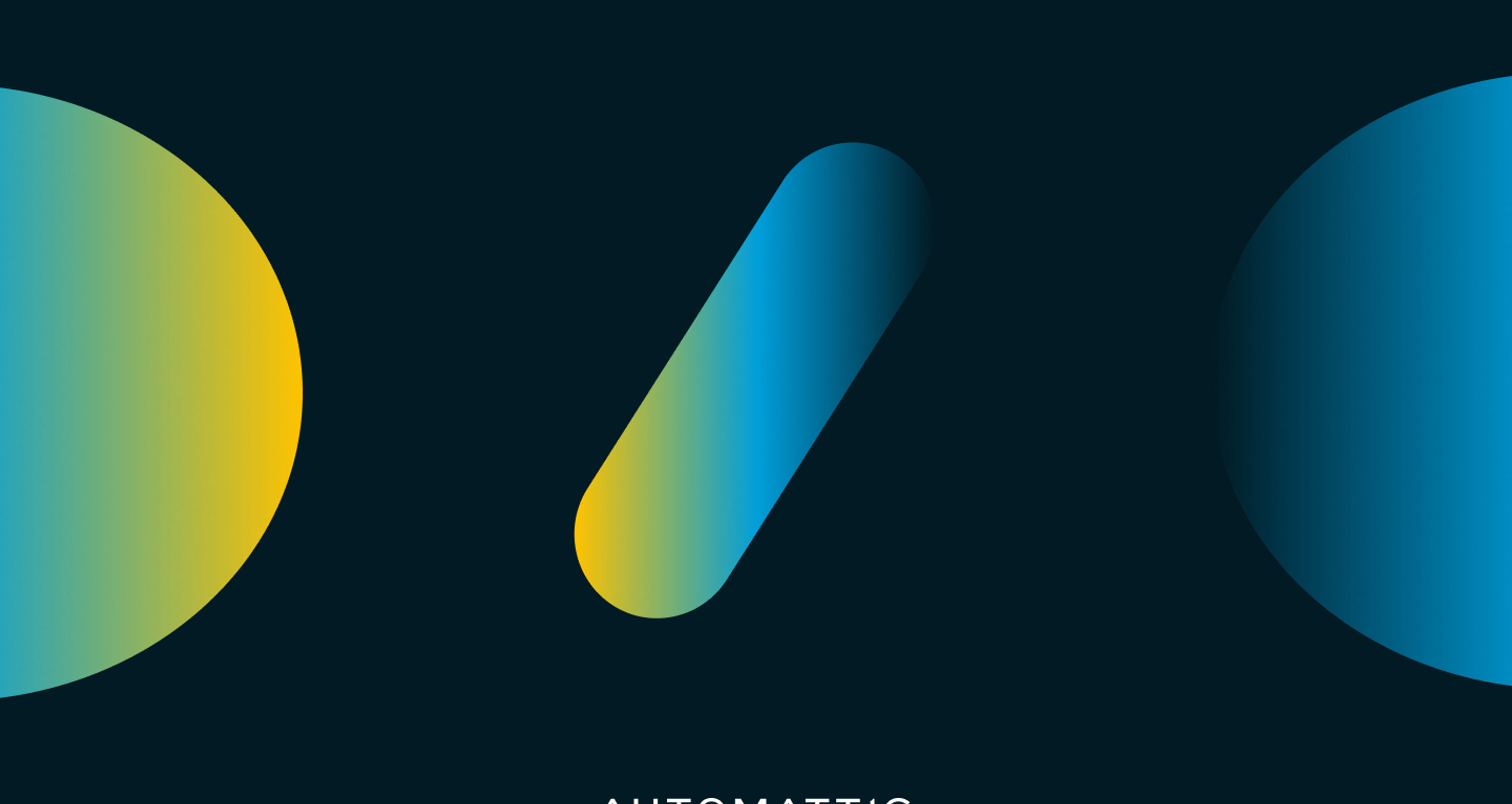
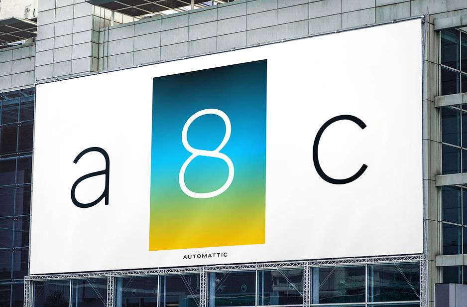
We explored different approaches, but the breakthrough in our process occurred when we took the original logo and broke apart the elements. This created a new set of visual devices that became the foundation of the language.
Automattic Logo
Deconstructed Elements
Visual System
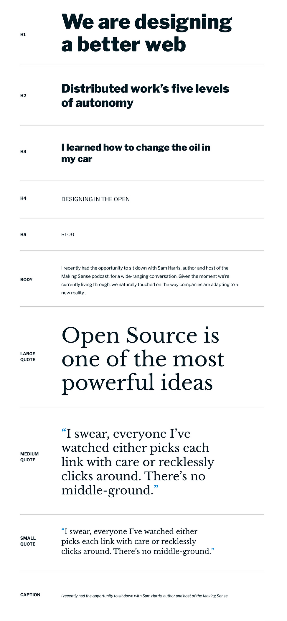
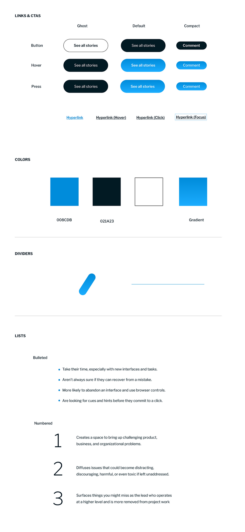
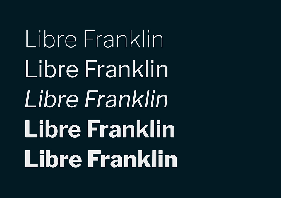
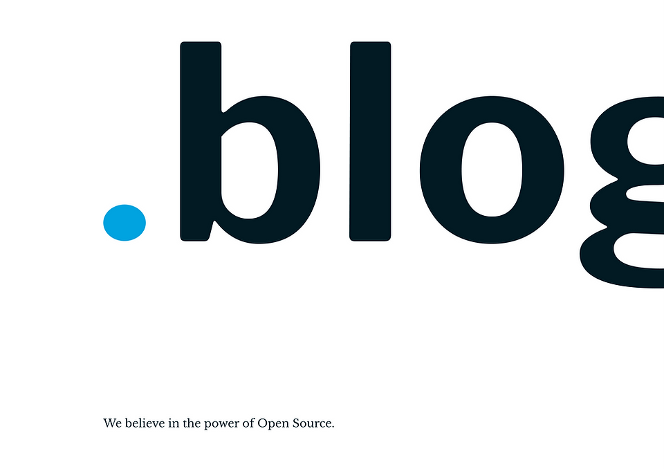
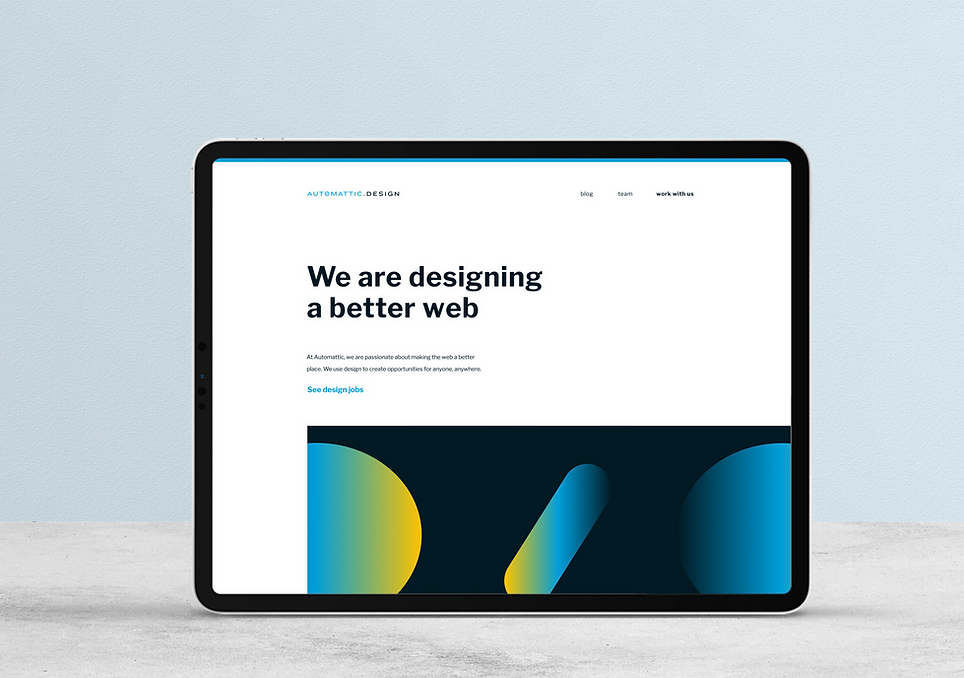
With our key elements in place, we were able to start creating new pieces of the visual brand. We updated the shade of blue and introduced a new gradient. The power of open source is foundational to Automattic, so it only made sense to only use open source typefaces. We relied heavily on various weights of Libre Franklin, paired with Libre Baskerville as an accent.
Blue: #009FDB
Black: #021A23
Yellow: #FFC300

Brand Gradient
Libre Franklin — Primary
Aa
ABCDEFGHIJKLMNOPQRSTUVWXYZ
abcdefghijklmnopqrstuvwxyz
1234567890
Libre Baskerville — Accent
Aa
ABCDEFGHIJKLMNOPQRSTUVWXYZ
abcdefghijklmnopqrstuvwxyz
1234567890
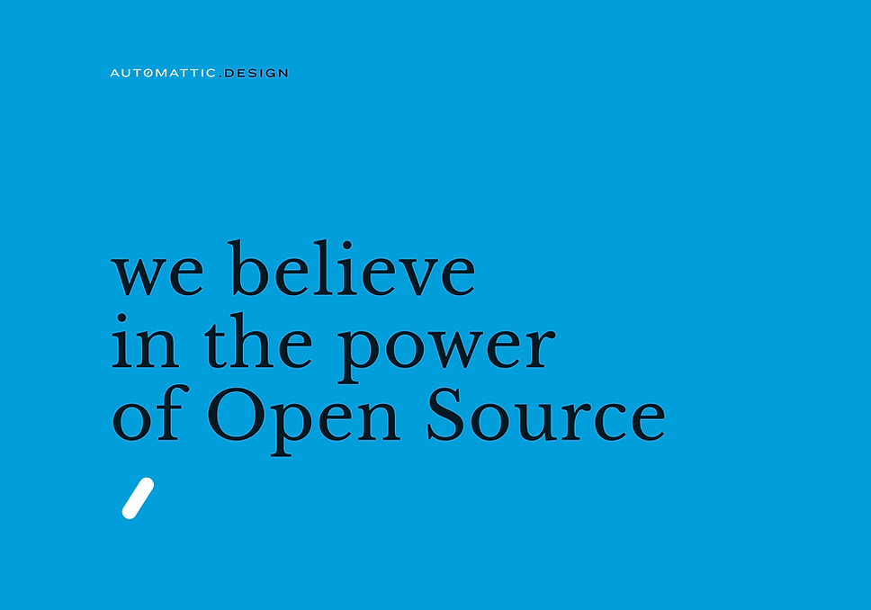
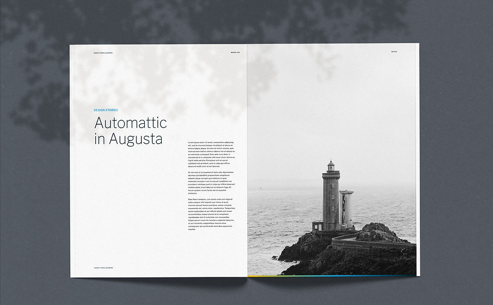
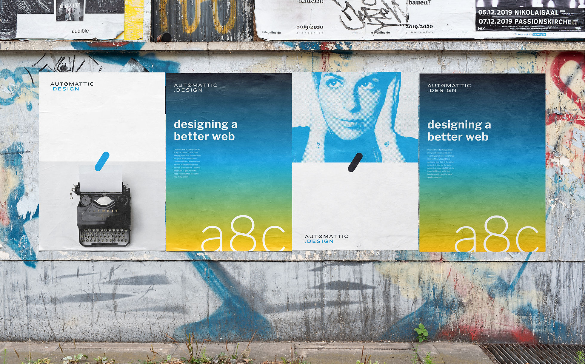
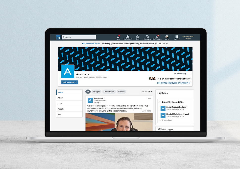
Visual System
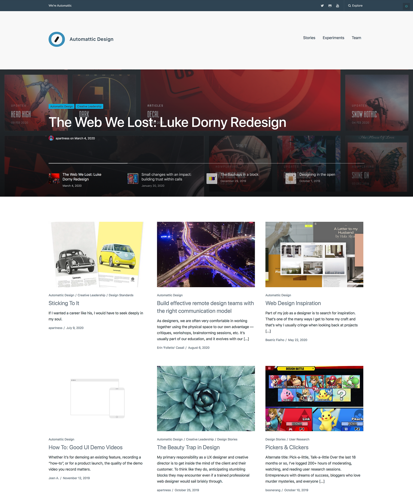
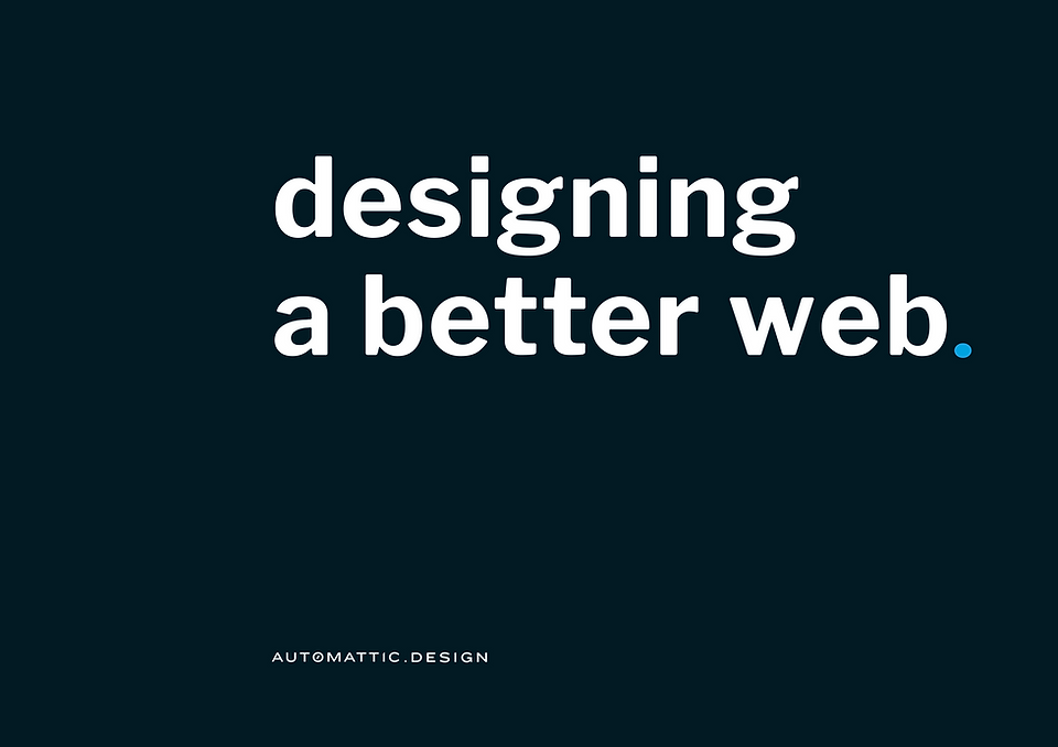
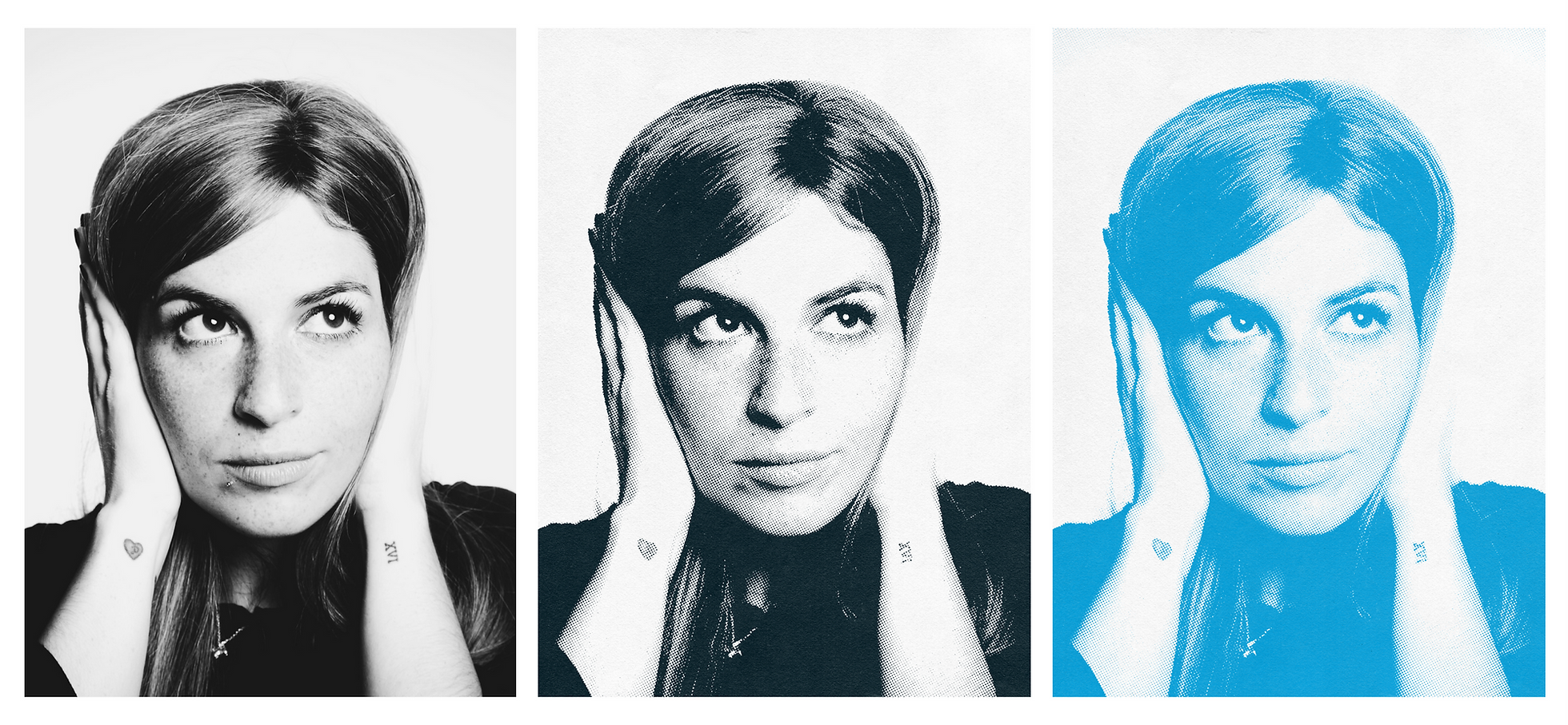
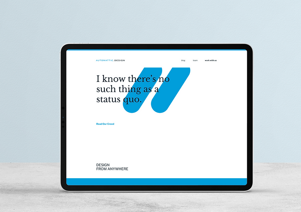
Once the colors, typeface, patterns, and photography style were established, we were able to experiment with different ways these elements worked together across print, environmental, and digital design.
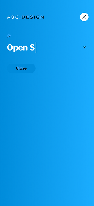
Creating a Theme
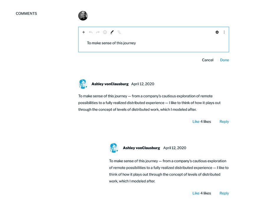
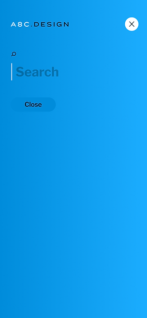
But, of course, we still weren't done! It was time to take all of that visual development and apply it to create a brand new WordPress theme for the blog. We designed this from the ground up, creating the entire design system, including all type styles, buttons, comments, nav, page layouts, and custom blocks.
Creating a Theme